Monday Inspiration by Beatrice: Trick or Treat Collection
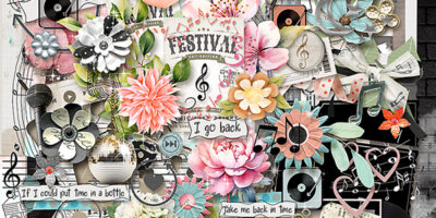
Good morning and happy Monday. I’m back on the blog to inspire you by showing you layouts made with Trick or Treat Collection.
In honor of this post and the upcoming holiday, Karen has made this collection available at a special, reduced prices so make sure you grab it before the sale ends. The collection is available at
Snickerdoodle Designs The Digichick
The community where I grew up did not allow trick or treating but there was a party at the rec center which gave everyone a chance to wear costumes. I’m surprised I can’t find any old photos, but as I recall I always wore my ballet costume from my most recent recital. Not very exciting I suppose, but as a child it’s more about the candy than anything else.
I love the curved borders in Treats Please by 6grand. She also used a template by Heartstrings Scrap Art. The large photo is exceptional, especially with the toddler climbing out the front door to join in the fun. The cluster down the side is so pretty and I like the way she added the glittered title at an angle underlining it with the arrow pointing into the page. The spattering of stars gives the page a sparkly look, perfect for this fun holiday.

Norma used one of my favorite products from SnickerdoodleDesigns, a Droplet Template, in her layout Halloween. The focus remains on the adorable photos. I like the clusters she added in the empty template spots and I really like the swish emanating from the ghost. It helps carry the eye across the page. If you have lots of photos and little time, remember to combine a droplet template with the ready-made clusters found in the collection for a gorgeous page in minutes.

I like the scene created by laureengillis49 in Trick or Treat. It looks to me like she started with the moon paper in the kit and moved it to work better with her composition and the ghost springing forth. Her extractions are perfect and I like the way the side view is leaning up against the skeleton. There are a lot of little details added, like the eyes peeking from the witch hat and the wall serving as a platform, that make this layout so appealing.

I love the use of multiple masks in Spooky Skeletons by robinsk. The larger mask is from Kimeric Kreations. The paper stacking frames the page while the stitching holds it all together. The large cluster in the bottom balances the journal card at the top. I like the way she tied it to the page with a raffia bow and stapled it too.

My last page features a not so scary witch, When Witches Go Riding, by dj_w. She used a template by Heartstrings Scrap Art. I like the diagonal flow of the page and the way she used the mask to retain the photo as the focal point. The clusters in opposite corners preserve balance and the poem she chose for her journaling is perfect.

I’ve come to the end of my post and I hope I have inspired you with a variety of styles. The collection is so packed with an assortment of papers and embellishments I know you will find everything you need to scrap your Halloween or even fall pages.
Thanks so much- I’ll be back next week with more inspiration for you.


