Digital Scrapbook Layout Inspiration
Do you find digital scrapbook layout inspiration elusive at times? Who hasn’t looked at a blank page and felt stuck or uninspired?
Getting digital scrapbook layout inspiration from others can be beneficial in several ways.
- First, it can spark your creativity and help you come up with fresh ideas for your own layouts. Seeing how others have combined different elements, colors, and designs can inspire you to experiment and try new things in your own layouts.
- Second, it can provide you with practical guidance on layout composition, photo placement, and other design principles. Observing how others have arranged their digital elements can give you insight into effective layout design and help you improve your own skills.
- Finally, it can foster a sense of community and connection with fellow scrapbookers. Sharing and admiring each other’s layouts can create a supportive and inspiring environment where you can learn from each other, exchange ideas, and celebrate each other’s creativity. Overall, drawing inspiration from others can enhance your digital scrapbooking experience and lead to more engaging and visually appealing layouts.
Vintage Easter Village Inspirational Layouts
While all of these pages are different in style, I find them all equally inspirational.
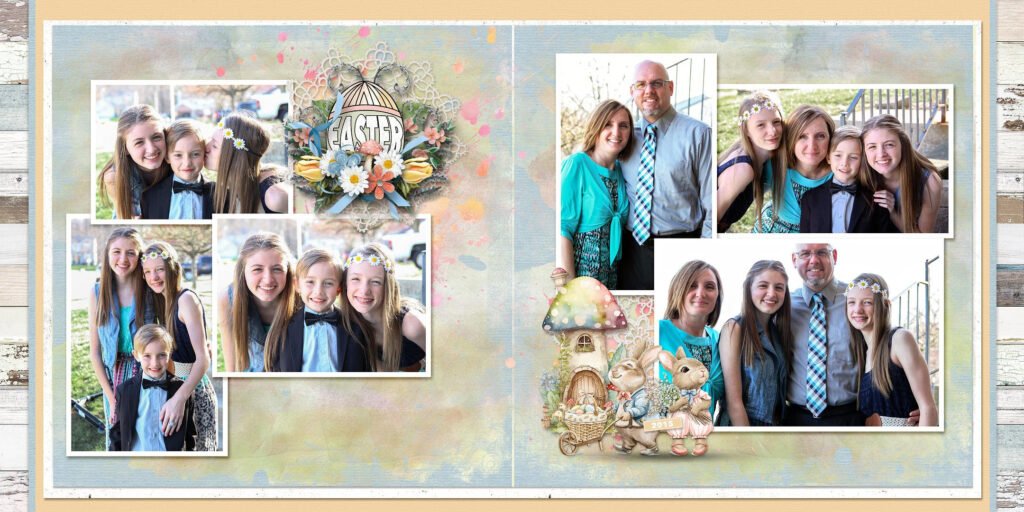
This double-spread page by Yvonne has clean lines while still maintaining an interesting photo placement.
She has used the kit elements perfectly, adding interest to her page but not
allowing them to overwhelm the viewer or take the focus off her beautiful photos.
![]()
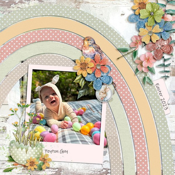
Sandy’s page is absolutely delightful. She used one of Lisa Rosa’s
Somewhere Over The Rainbow templates as a starting place, and added sweet
clusters to embellish her page. I also like how she used one of the kit embellishments to add the date.

![]()
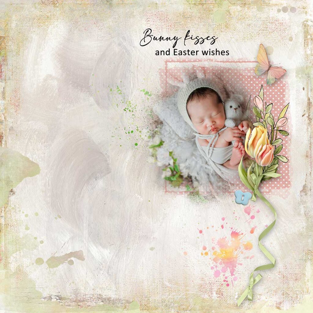
I love white space pages, and Norma chose the perfect background paper to use for her layout.
She added additional interest by adding one of the Vintage Easter Village Edges.
I love that she clipped a paper to one of the Masks too.
Using 2 different fonts makes her title really fun.
![]()
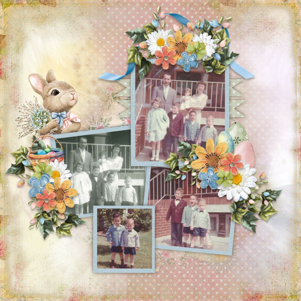
Joyce used one of my favorite techniques on her page, which is layering papers.
By resizing one of the backgrounds, she can bring more texture and color onto her page
by allowing a 2nd background to be visible. She also creates beautiful clusters
which add to her page. The use of the watercolor splat and the grid stamp
to anchor her photo, helps draw the viewer’s eye to her sweet picture.
![]()
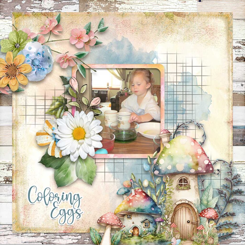
Kabra’s clusters are always so pretty and the ones on her page
are no exception. She positions them so they help draw
the viewer’s eye around the page and land on her sweet photo.
Which page inspires you? What will YOU create today?
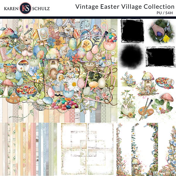
Layout inspiration created with Vintage Easter Village available at:
Karen Schulz Designs | Oscraps | GingerScraps | MyMemories


